COVID-19: COUNTRY-to-COUNTRY COMPARISON
As at 04 January 2021: Updated each day at 4:00pm NZ time (4:00am UTC)
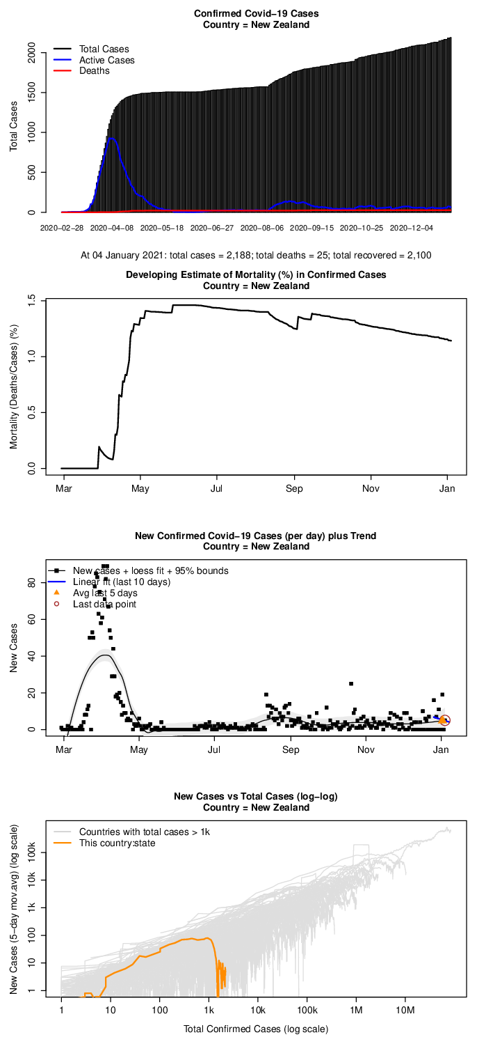
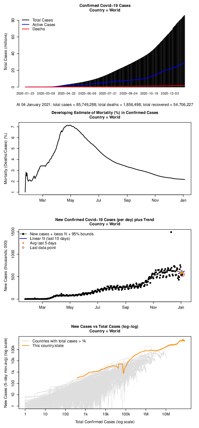
Chart notes
These charts are created and provided here for educational purposes only.
The first (top) chart gives the progressive total confirmed (official) cases together with the known active cases and recorded deaths. Active cases are the total cases less those who have recovered or died. Note that there are (likely) many more actual cases as only cases identified through testing are recorded as confirmed cases. This number is therefore affected by each country's ability to undertake testing.
The second chart plots the developing death rate. This is the total deaths divided by the total confirmed cases at each point in time. A high indicated death rate may be reflective of an overwhelmed medical system or simply that there is a larger number of actual cases in the country compared to the official confirmed cases for that country. The death rate (generally) increases towards a final settled value as there is a time lag beween recording new cases and those persons who caught the disease and then died from it later.
Note also that, as the likely 'true' mortality is between 1 to 2 percent (assuming the medical system has not been totally overwhelmed), a measured mortality of (say) 10% may mean the actual number of cases in the community could be several times greater than the number of cases recorded through testing. This is of concern as unrecognised cases are more likely to be infectious through lack of quarantine measures.
The third chart is the most important one; it gives the number of new confirmed cases each day and indicates if the disease is increasing, stable or decreasing in its spread in the selected country. We have a fitted simple regression to the most recent 10 days of data and plotted the average new cases for the last 5 days to indicate both the trend and the potential change in trend.
A Loess (moving regressional fit) together with the 95% confidence bounds of the loess fit line is included to illustrate the likely bounds of the new confirmed cases line given the evident daily variation in new case numbers observed in many of the charts.
The forth (bottom) chart plots the confirmed new cases on the y-axis against the total number of confirmed cases on the x-axis. This is displayed on log scales (both x and y) for 2 reasons: firstly it linearises exponential growth trends; and secondly it compresses large numbers so all countries can be seen together. The changing gradient (slope) of each countiy's curve indicates if its public health measures are taking effect or not. An upward (positive) slope indicates the disease is continuing its exponential growth within the community (and where all countiies show this slope until public measures like social distancing and lock-downs are implemented and take effect). A horizontal (flat) slope incicates the rate of increase has peaked and a downward (negative) slope indicates that the disease is exponentially diminishing within the community.
The public health measures being applied are illustrated in their effect by how the country's curve "falls-off" the base trend. Examples of this are Taiwan, China, and China:Hubei. Further explanation on this type of curve for covid-19 analysis can be found here.
Data source
Data for these charts is pulled each day from the time series data compiled by the Centre for Systems Science and Engineering (CSSE) at Johns Hopkins University (data at https://github.com/CSSEGISandData/COVID-19/blob/master/csse_covid_19_data/csse_covid_19_time_series/time_series_covid19_confirmed_global.csv)
Acknowledgments
In creating the scripts for these charts, we took note of the excellent blog by Tim Churches at https://www.r-bloggers.com/covid-19-epidemiology-with-r/
We also note Henry Reich's 'Minute Physics' You-tube video on plotting covid-19 exponential growth.
Disclaimer
HML disclaims any and all representations and warranties with respect to this webpage, including accuracy, fitness for use, and merchantability. Reliance on this webpage for medical guidance or use of this webpage in commerce is prohibited.

©Hyland McQueen Limited 2020